Wake Up With the Wolves
Overview
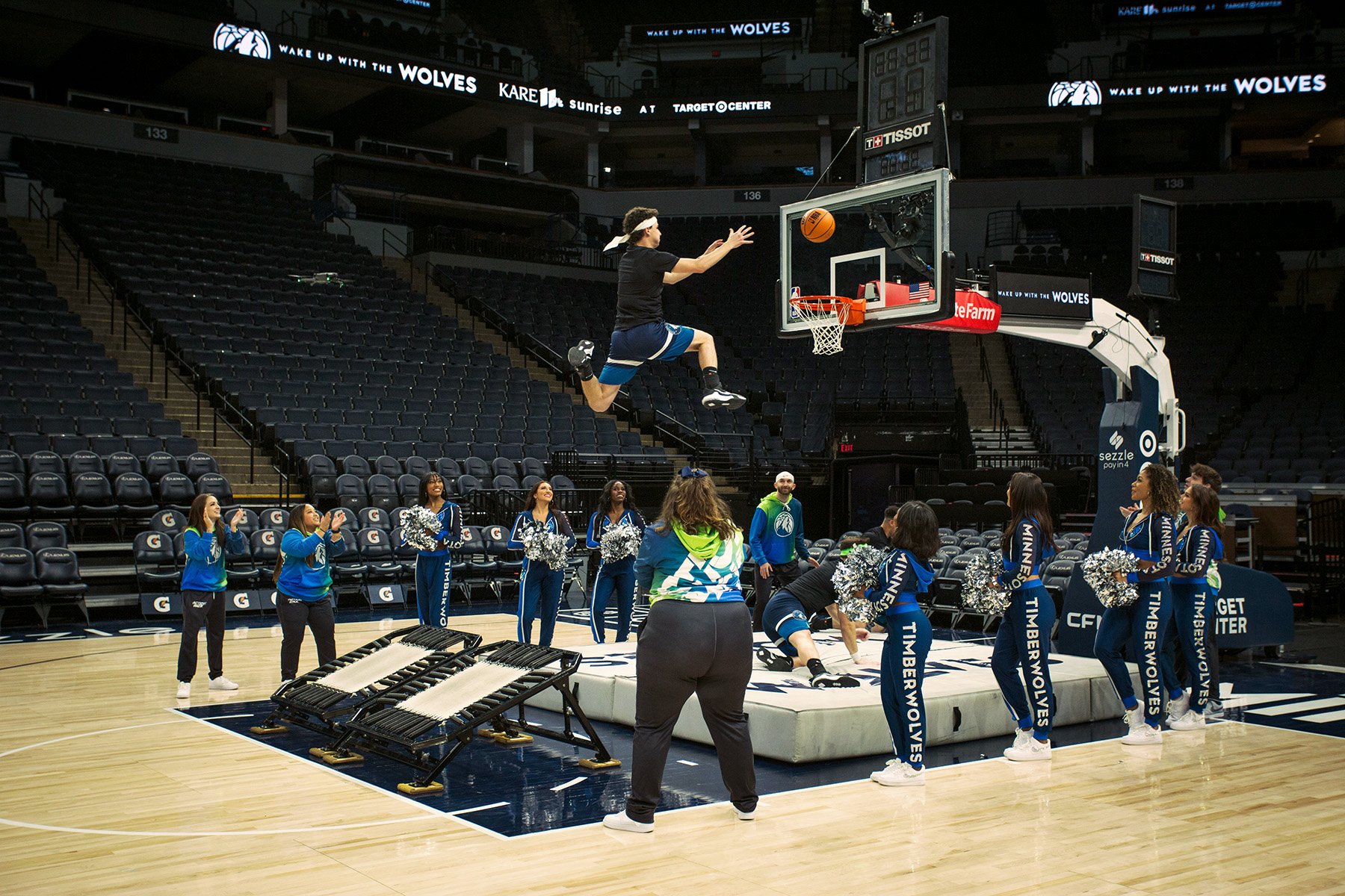
The Wolves are back on broadcast with KARE 11, baby! To announce the special occasion of select games returning to over-the-air TV, I familiarized myself with the Timberwolves brand and created a harmonious look and feel between both KARE and the Wolves brands.
The ask
Take guidance from the Minnesota Timberwolves creative marketing team in creating specialized branding for the morning event. Lean more into the Timberwolves aesthetic and colors. Additionally, create a specialized official lockup to use in media announcements.


Schedule layouts
The logo: A closer look
For starters, I can’t get over that electric green! I knew I wanted that to be a major feature. I adapted the Sunrise arch I developed for their show brand during the Paris Olympics, as it really fit with the sporty aesthetic.
The top line of “Wake up with the” felt like the perfect opportunity to use the letterforms found in the Timberwolves wordmark. I crafted “k”, “u”, “p”, and “t” from the existing information and kerned everything carefully (say that five times fast).


Credits
My roles: Logo designs, typography, animation, file handoff, typesetting
Client: KARE 11 & the Minnesota Timberwolves
Art direction: Jim Thomas, Heather Meyer, Mike Grahl
Stadium logo placements: Minnesota Timberwolves creative team
Photography: Daniel Crowe & Mike Scheuermann